Orlen & Orlen Paczka Graphic Design
Orlen Campaigns
Orlen Campaigns
This showcase represents a long-term design collaboration involving various marketing and communication tasks for the ORLEN Group.
This showcase represents a long-term design collaboration involving various marketing and communication tasks for the ORLEN Group.

Orlen w Portfelu
Project Brief
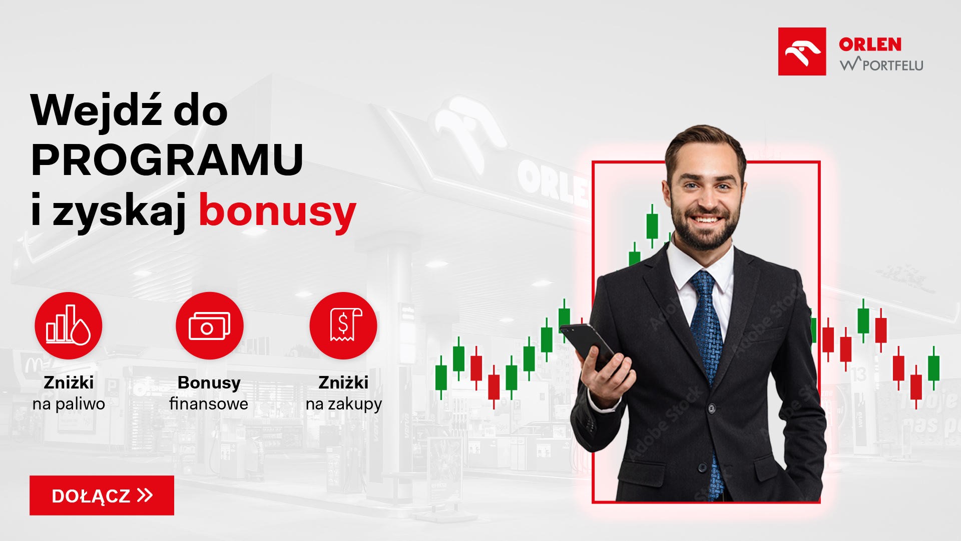
The goal was to design a Key Visual (KV) for an online campaign promoting "ORLEN w portfelu" – a loyalty program for individual shareholders. The creative needed to build trust and stability while clearly showing benefits like fuel discounts and investment bonuses. I also had to ensure the design stayed within strict legal guidelines for financial promotion.
Design Solution
I created a high-tech financial composition that blends a gas station interior with dynamic stock charts. By using a premium smartphone mockup, I highlighted the "digital wallet" concept. I used a clean, iconographic style to make the program’s three main pillars (shopping, fuel, and financial benefits) easy to understand at a glance.
Orlen w Portfelu
Project Brief
The goal was to design a Key Visual (KV) for an online campaign promoting "ORLEN w portfelu" – a loyalty program for individual shareholders. The creative needed to build trust and stability while clearly showing benefits like fuel discounts and investment bonuses. I also had to ensure the design stayed within strict legal guidelines for financial promotion.
Design Solution
I created a high-tech financial composition that blends a gas station interior with dynamic stock charts. By using a premium smartphone mockup, I highlighted the "digital wallet" concept. I used a clean, iconographic style to make the program’s three main pillars (shopping, fuel, and financial benefits) easy to understand at a glance.


Orlen Paczka x Zoo Art
Project Brief
The goal was to create a compelling promotional banner for the ORLEN Paczka and Zoo Art partnership. I needed to communicate a special offer - free pet food with every delivery - while balancing the visual identities of both brands. A key challenge was to make the offer stand out while maintaining a friendly, e-commerce-ready look.
Design Solution
The composition uses a lifestyle-oriented image to build an emotional connection with the customer. I introduced a dynamic, slanted container for the "Karma GRATIS!" offer to drive attention, while maintaining a balance between ORLEN Paczka’s red branding and Zoo Art’s playful elements like paw prints.

Orlen Paczka
Project Brief
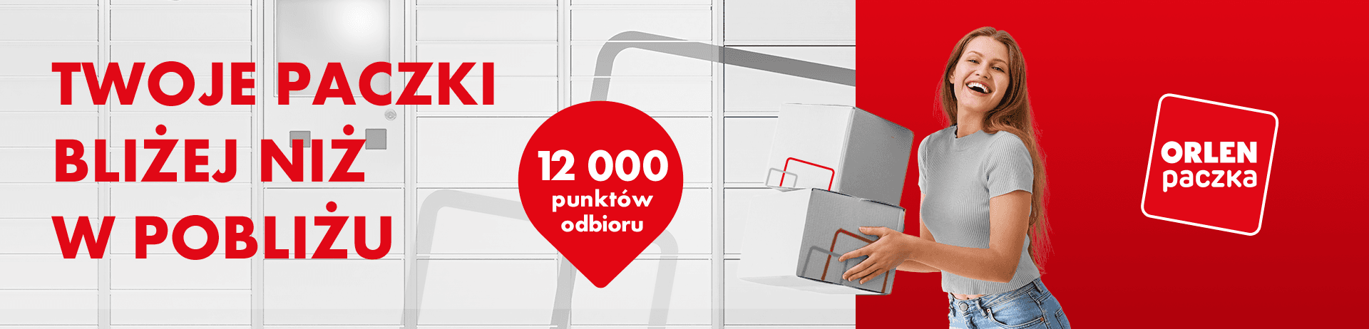
The goal was to create a high-impact web banner for ORLEN Paczka, focusing on the convenience of their delivery network. I had to communicate the vast scale of the service (over 12,000 points) while keeping a friendly and approachable tone for everyday e-commerce shoppers.
Design Solution
I designed a minimalist banner with a strong horizontal split: automated lockers on the left to show the infrastructure, and a bold brand-red section on the right for the call to action. By featuring a joyful person with parcels, I made the brand feel more relatable and emphasized how easy and satisfying the service is to use.
Orlen Paczka
Project Brief
The goal was to create a high-impact web banner for ORLEN Paczka, focusing on the convenience of their delivery network. I had to communicate the vast scale of the service (over 12,000 points) while keeping a friendly and approachable tone for everyday e-commerce shoppers.
Design Solution
I designed a minimalist banner with a strong horizontal split: automated lockers on the left to show the infrastructure, and a bold brand-red section on the right for the call to action. By featuring a joyful person with parcels, I made the brand feel more relatable and emphasized how easy and satisfying the service is to use.
Orlen Paczka - Mailing
Project Brief
The goal was to design a comprehensive mailing template for ORLEN Paczka to increase customer awareness of delivery speeds and pickup options. The main challenge was to organize complex information - such as delivery times and pickup locations - into a clean, scannable layout that effectively drives conversions.
Design Solution
I created a hierarchy-driven design that naturally guides the user’s eye from the main value proposition down to the Call To Action (CTA). By using clear sections and icons, I ensured that the information is easy to digest at a glance, making the entire physical mailing both professional and highly readable.