GPW Group – UX Audit & Information Architecture
GPW Group Case Study
GPW Group Case Study
I analyzed 8 different GPW Group websites to find navigation errors and structural issues. This audit mapped out exactly where the current system was failing users.
I analyzed 8 different GPW Group websites to find navigation errors and structural issues. This audit mapped out exactly where the current system was failing users.

Challenge & Goal
Why a minor facelift wasn’t enough
The GPW Group ecosystem consisted of 8 large, aging portals that had grown inconsistently over the years. The ultimate goal was to prove to the client that a minor facelift wouldn't work – a complete, unified redesign was the only way forward.
The GPW Group ecosystem consisted of 8 large, aging portals that had grown inconsistently over the years. The ultimate goal was to prove to the client that a minor facelift wouldn't work – a complete, unified redesign was the only way forward.


My role & process
Showing how the old system was broken…
My job was to document the chaotic structure of all eight portals. I started by mapping the current Information Architecture (IA) and the logic across all websites. This allowed me to visualize how the navigation was confusing users and where the system was fundamentally broken.
My job was to document the chaotic structure of all eight portals. I started by mapping the current Information Architecture (IA) and the logic across all websites. This allowed me to visualize how the navigation was confusing users and where the system was fundamentally broken.
I looked into every detail, including footers and complex internal links. I spent a lot of time mapping every nested menu item to find conflicting logic and redundant pages. This analysis gave me the hard evidence showing that the current setup was impossible to navigate.
I looked into every detail, including footers and complex internal links. I spent a lot of time mapping every nested menu item to find conflicting logic and redundant pages. This analysis gave me the hard evidence showing that the current setup was impossible to navigate.
Note on Process & Confidentiality
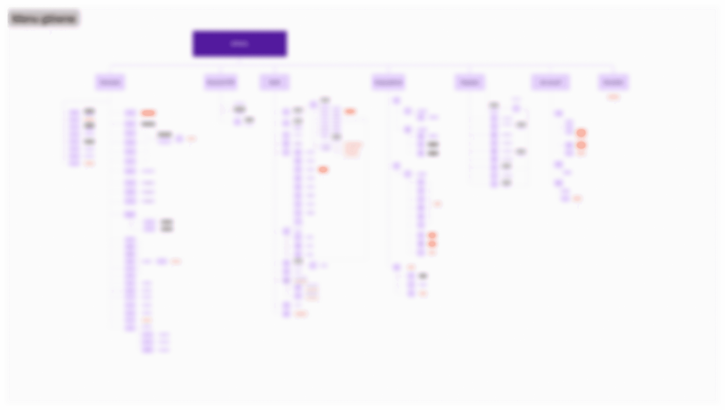
The visualizations below showcase the audit of the main GPW portal. This same deep-dive methodology was applied to all 8 portals in the ecosystem. All screens are intentionally blurred due to NDA restrictions to protect sensitive business logic, while demonstrating the true scale and complexity of the mapped architecture.

GPW - Main Menu
GPW - Top Menu

GPW - Main Menu
GPW - Top Menu
GPW - Core content
GPW - Core content
GPW - Footer

GPW - Footer
GPW - Ecosystem Cross-linking & Structural Redundancy

GPW - Ecosystem Cross-linking & Structural Redundancy
Heruistic evaluation
Pointing out exactly where the portals fail…
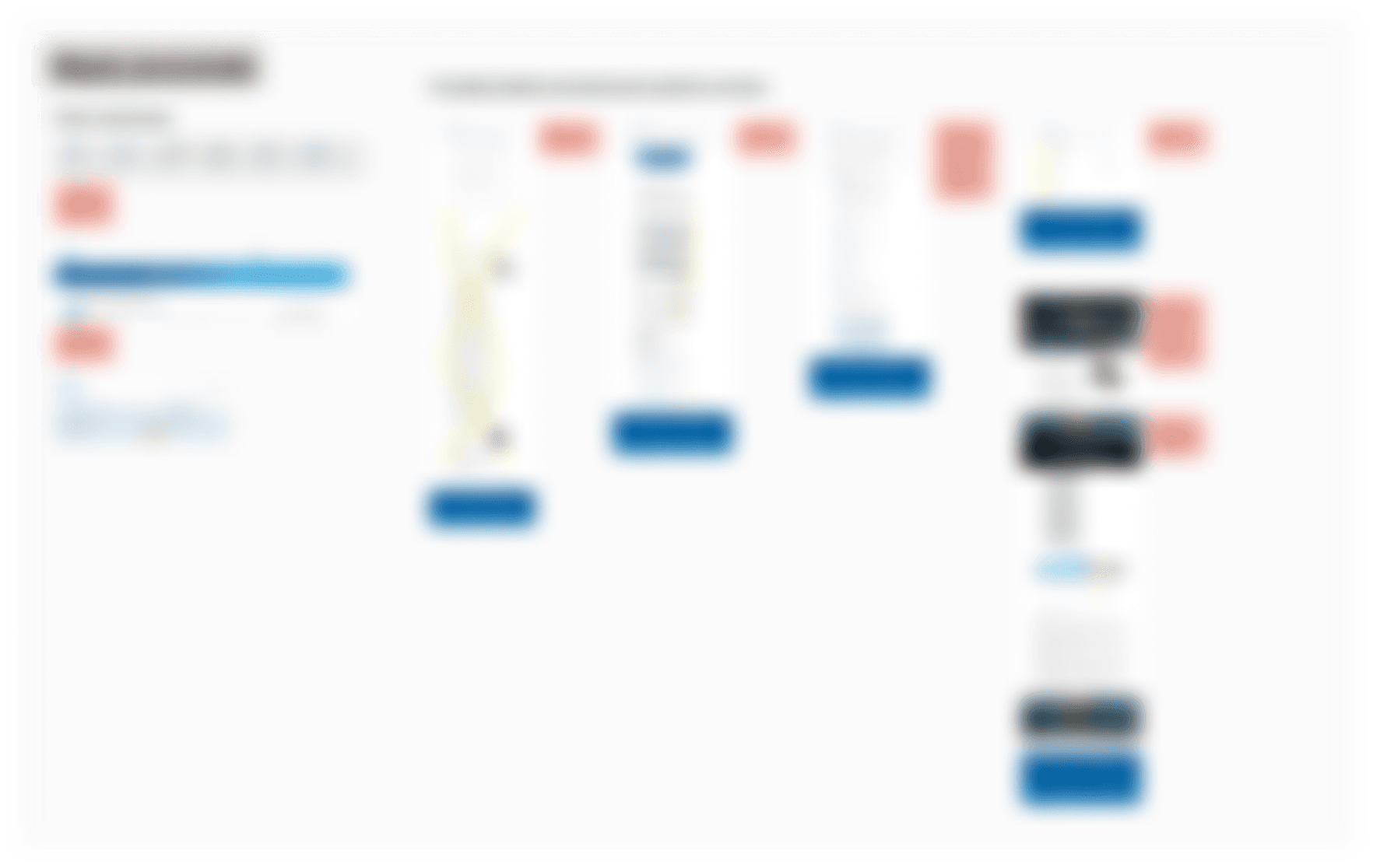
To find out what was actually broken, I went through the portals and took screenshots of the most problematic areas. I tagged every error, confusing element, and broken link with a digital sticky note. This process allowed me to find the critical issues that made the websites hard to use. By putting all these findings on a map, I could show the stakeholders the density of the usability problems, proving that a simple update wouldn't be enough and a full redesign was necessary.
To find out what was actually broken, I went through the portals and took screenshots of the most problematic areas. I tagged every error, confusing element, and broken link with a digital sticky note. This process allowed me to find the critical issues that made the websites hard to use. By putting all these findings on a map, I could show the stakeholders the density of the usability problems, proving that a simple update wouldn't be enough and a full redesign was necessary.
Aesthetics and minimalism in the context of an information service

Aesthetics and minimalism in the context of an information service
Consistency and compliance with standards

Consistency and compliance with standards
System visibility in the context of an information service

System visibility in the context of an information service
Remaining errors
Remaining errors
Research results
From small fixes to a full redesign
The Argument
The Argument
I mapped the chaotic architecture and documented every usability error to show the real state of the system. This evidence proved that the portals had reached their limits, a simple visual refresh was not enough to fix the core problems.
I mapped the chaotic architecture and documented every usability error to show the real state of the system. This evidence proved that the portals had reached their limits, a simple visual refresh was not enough to fix the core problems.
The Impact
The Impact
My analysis gave the client a clear reason to choose a full redesign. By showing the scale of the structural issues.
My analysis gave the client a clear reason to choose a full redesign. By showing the scale of the structural issues.